Hey Beth,
I know you were expecting me to do a whole project full of my photography and nothing else. I know, I was expecting the same thing. Seeing that I'm a huge procrastinator, and something like the ideas I had for photographs would need planning for models (at least the route I was going to take). I didn't balance my time and never got the ball rolling. So I just went ahead and put some other things together that I could. Thanks for the wonderful second experience in your class. I really wish I showed you my photography a LONG time ago. Now that I have, you will definitely be seeing a lot of me over the years in your office showing you my new work and asking you questions. So, I will be seeing you soon! I hope to get enrolled in your RAW class. Anyway, don't be too harsh on me with the grading. I wish I could have impressed you with some awesome new photography. That shall happen anyway, just not right now. Haha. See ya!
- Austin Stovall
Wednesday, April 24, 2013
Feather Light

Category #1: Feather Light
This photo was used in my portfolio. The edit was more of a orange tint. It was a very warm photo. This photo is a re-do as I try to make it the opposite a little bit. I wanted to try to cool down the photo. The photo on the left is the actual original photo straight from the camera, no edit. I took this photo with my DSLR.
I turned down the temperature down to a cooler tone. I turned down the exposure a bit, bumped up the contrast a bit, and played around with the levels. I messed with the levels of saturation for each individual color including the blue, green, orange, purple, and magenta, which I raised in different variations. I then created a layer, turned it into a smart object and added a bit of noise to the photo.
Club Black
Category #4: Club Black (not a real club to my knowledge)
Not a real story behind this, I just wanted to make some cool typography with a black theme.
This was made all from scratch except the font. I used the layer styles to make it more 3D, Bevel and Emboss. Used the pen tool to make the blue stroke inside the letters. I used the dodge tool for the highlights.
Wasted
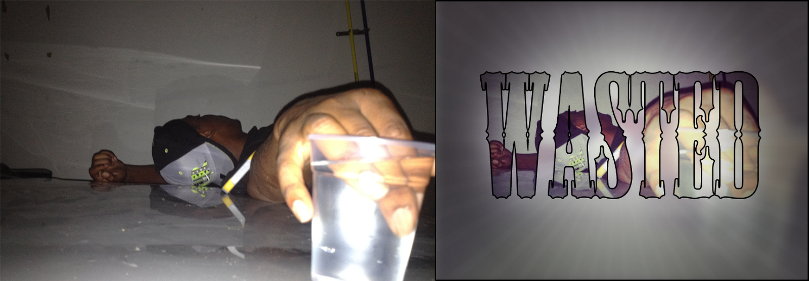
Category #2: Wasted
I took this on my iPhone last year. My friend looked dead basically. So this photo is basically a blatantly obvious image of what "Wasted" looks like.
I used "wasted" and turned it into a clipping mask of my friend wasted. I duplicated the layer and added the Gaussian blur on the original photo. I used the gradient tool and a new layer, used the radial gradient, black to transparent. I then used a brush called rising sun which gives off the sun ray effect. Lastly, I added a photo filter.
Minimalist Batman Poster

Category #9: Minimalist Batman Poster
Started out with the all black background, and created a new layer. Created filter render clouds. I used the lasso tool to make the beam of light that goes up in the sky. I used the ellipse tool to make the circle. Used a stencil like brush called skyline to make the buildings. The bat man symbol was cut out of the picture on the left from: http://www.highsnobiety.com/files/2012/12/the-evolution-of-the-batman-logo-2.jpg
Masculinity

Category #11: Masculinity
I think this is a very masculine photo. Men go to barbers to get their hair cut. That's always a very manly activity where you talk about manly things with other men. Taken by myself on my iPhone.
Duplicated the layer and added the Gaussian blur, masked him out of the blur to make the shallow depth of field. Used a brown photo filter, adjusted the levels and curves to adjust the shadows and highlights.
Feminina

Category #12: Feminina
Disney princesses showing their feminine side. This photo was taken by myself on my iPhone.
I duplicated the layer, added Gaussian blur. I masked out the dolls, the remote, and the arm of the couch to create the shallow depth of field effect. I used plastic wrap from the filter gallery, used photo filters to change the colors of the shadows, midtones, and the highlights to make them look more appealing.
Subscribe to:
Posts (Atom)